
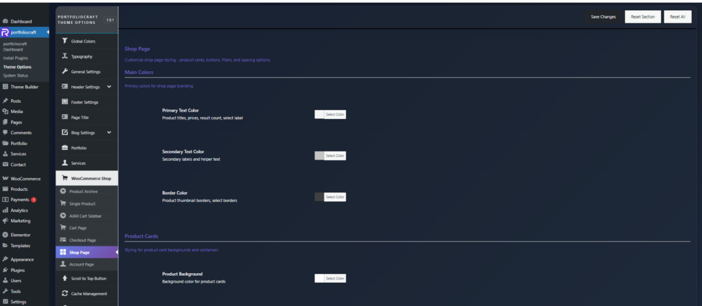
Main colors
These define the overall visual language of the shop.
- Primary Text Color
Used for key elements like product titles, prices, result count (“Showing X–Y of Z results”), and select labels. - Secondary Text Color
Used for supporting labels, helper text, and less important information. - Border Color
Applied to product thumbnail borders and select/dropdown borders to separate elements clearly.
Product cards #
Style the product card container and image area.
- Product Background
Background color of the entire product card (title, price, button, etc.). - Product Thumbnail Background
Background of the image area only, useful for giving product photos a neutral or branded backdrop. - Thumbnail Border Color
Border color around product images, helping them stand out against the card or page background.
Add to cart button #
Control the appearance and hover state of the add to cart button on product cards.
- Button Background
Normal background color of the add to cart button. - Button Text Color
Color of the icon/text on the button. - Button Border Color
Outline/border color; set to match background for solid buttons or contrast for outlined style. - Button Hover Background
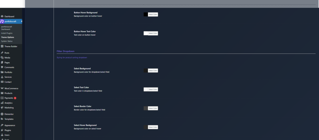
Background color when hovering over the button. - Button Hover Text Color
Text/icon color on hover, ensuring readability against the hover background.
Filter dropdown (sorting) #
These options style the “Sort by” / product sorting select dropdown.
- Select Background
Background color for the dropdown/select field. - Select Text Color
Text color of the selected option and options list. - Select Border Color
Border color of the select element. - Select Hover Background
Background color when hovering over the select. - Select Hover Text Color
Text color while hovered, keeping the control accessible and clear.
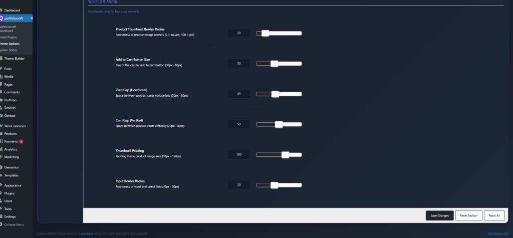
Spacing & sizing #
Adjust spacing, card gaps, and roundness.
- Product Thumbnail Border Radius
Roundness of product image corners: - Add to Cart Button Size
Diameter of the circular add to cart button (30–80px). Larger sizes are more prominent and easier to tap. - Card Gap (Horizontal)
Horizontal space between product cards in the grid (20–80px). - Card Gap (Vertical)
Vertical space between rows of product cards (20–80px). - Thumbnail Padding
Inner padding around the product image area (10–150px), controlling how much white space appears around images. - Input Border Radius
Corner roundness for inputs and select fields (0–50px), aligning filters and dropdowns with the rest of the design.
With these options, the Shop Page panel lets you build a consistent, branded product grid with clear buttons and filters, without writing custom CSS.


