
Global Color controls the main color system of the Rakmyat theme.
It dynamically changes the colors used across the theme for both Light Mode and Dark Mode.
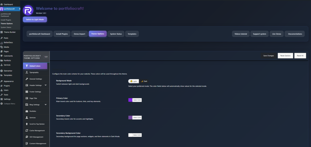
1. Where to find Global Colors #
- Log in to WordPress admin.
- Go to: Rakmyat Dashboard → Theme Options.
- Click on Global Colors in the left sidebar.
You will see the Global Colors panel with Background Mode and a list of color fields.
2. Background Mode (Light / Dark) #
At the top you have Background Mode with two options:
- Light
- Dark
When you switch between them, all color fields below automatically load the saved values for that mode.
This lets you keep two different color palettes, one for Light Mode and one for Dark Mode.
3. Colors in Dark Mode #
When Background Mode is set to Dark, the following fields control the dark palette:
- Primary Color: main brand color used for buttons, links, and key elements in Dark Mode.
- Secondary Color: accent color for highlights and small details in Dark Mode.
- Secondary Background Color: background for sections, widgets, and forms in Dark Mode.
- Background Color: main dark background color of the site.
- Heading Text Color: text color for headings and titles in Dark Mode.
- Body Text Color: regular text color in Dark Mode.
- Meta Text Color: color for meta information such as dates and categories in Dark Mode.
- Border Color: color for borders, cards, input fields, and dividers in Dark Mode.
4. Colors in Light Mode #
When Background Mode is set to Light, the same fields control the light palette:
- Primary Color: main brand color for buttons, links, and important elements in Light Mode.
- Secondary Color: accent color for highlights in Light Mode.
- Secondary Background Color: background for sections and widgets in Light Mode.
- Background Color: main light background color of the site.
- Heading Text Color: headings and titles color in Light Mode.
- Body Text Color: regular text color in Light Mode.
- Meta Text Color: meta information color in Light Mode.
- Border Color: borders and dividers color in Light Mode.
5. What Global Colors affect #
Global Colors affect:
- Theme default sections (headers, footers, blog, portfolio, services).
- Theme widgets and components that use the theme color system.
- Buttons, badges, backgrounds, and borders that are styled from theme options.
They do not automatically override colors of pages built manually with Elementor if those widgets have custom colors set
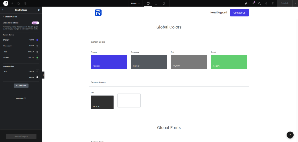
6. Elementor Site Settings (for Elementor pages) #
Pages created with Elementor use their own color system from:
Elementor → Site Settings → Global Colors.
Here you control:
- System Colors: Primary, Secondary, Text, Accent.
- Custom Colors: any extra colors used in Elementor widgets.
If you want Elementor pages to visually match your Rakmyat Global Colors:
- First set your brand colors in Rakmyat Theme Options → Global Colors.
- Then open Elementor → Site Settings → Global Colors.
- Set the same values:
- Primary: same as Rakmyat Primary Color (#4339E5 by default).
- Secondary: same as theme secondary color.
- Text: same as body text color.
- Accent: same as accent color (for example, call-to-action or success color).
- Click Save Changes in Elementor.
From now on, any Elementor widget that uses global colors will follow these values
7. Saving and applying changes #
- After changing colors in Theme Options → Global Colors, click Save Changes at the top of the panel.
- After changing colors in Elementor → Site Settings, click Update/Save at the bottom of the Elementor panel.
- Clear any cache plugin if colors do not change on the frontend.
Global Colors in Rakmyat Theme define the overall palette for theme elements, while Elementor Site Settings control the palette for Elementor-built pages. For a consistent design, configure both to use the same brand colors.


